Editing Concert Photos - Tweaking Colors & Saving Skin Tones
Let me preface this by saying that there are absolutely no wrong or right ways to edit concert photos. Some photographers prefer the more “straight out of camera”, natural or cleaner look (great examples of this are Todd Owyoung and Seth McConnell), while others might turn their live photos into works of art by editing them to the point where they look absolutely nothing like the original image (see Gina Scarpino, Lori Gutman and Cina Nguyen for some inspiration). BOTH of these are okay. Obviously, some media outlets or clients might prefer one over the other, BUT YOU DO YOU. One of the most important things about any kind of photography (in my opinion) is having your own unique style. This is simply how I edit in my style.
Tweaking Colors & Saving Skin Tones
When I’m editing, I generally try to stay pretty true to the original colors of the photo, maybe just tweaking them a bit to get some skin tones in the musician’s face or to get rid of any weird blowouts of banding that might be coming from the stage lights. Sometimes, though, the vibe of the show/artist/photos calls for something a little more outside of the box than simply editing for skin tones.
Sometimes, I’ll start with a blue image and end up with something super warm or vise versa. I wish I could explain how I end up setting on a specific color palate or tone, but it’s honestly usually something that just comes to me when I’m fiddling with sliders in Lightroom or even listening to the band as I edit and an idea just hits me. BUT, I’ll try to explain my thought process on some of these a little bit.
Below are three different examples of shots that I ended up editing to save the skin tone of the artist and/or change the colors of the overall image. The first shot of Hippo Campus is on the heavier side when it comes to editing (at least for me) so I thought it would serve as a good example of how much you can change a photo using Lightroom. The YUNGBLUD photo is a bit simpler and cleaner and serves as a good example of saving skin tones and editing for a specific color. The Now, Now photo was honestly one I was really happy with straight out of camera, but I thought it would be fun to cover as I ended up tweaking the colors in it quite a bit for a more uniform end result. I’ll probably do more blogs like this in the future, but here are a couple of examples for now!
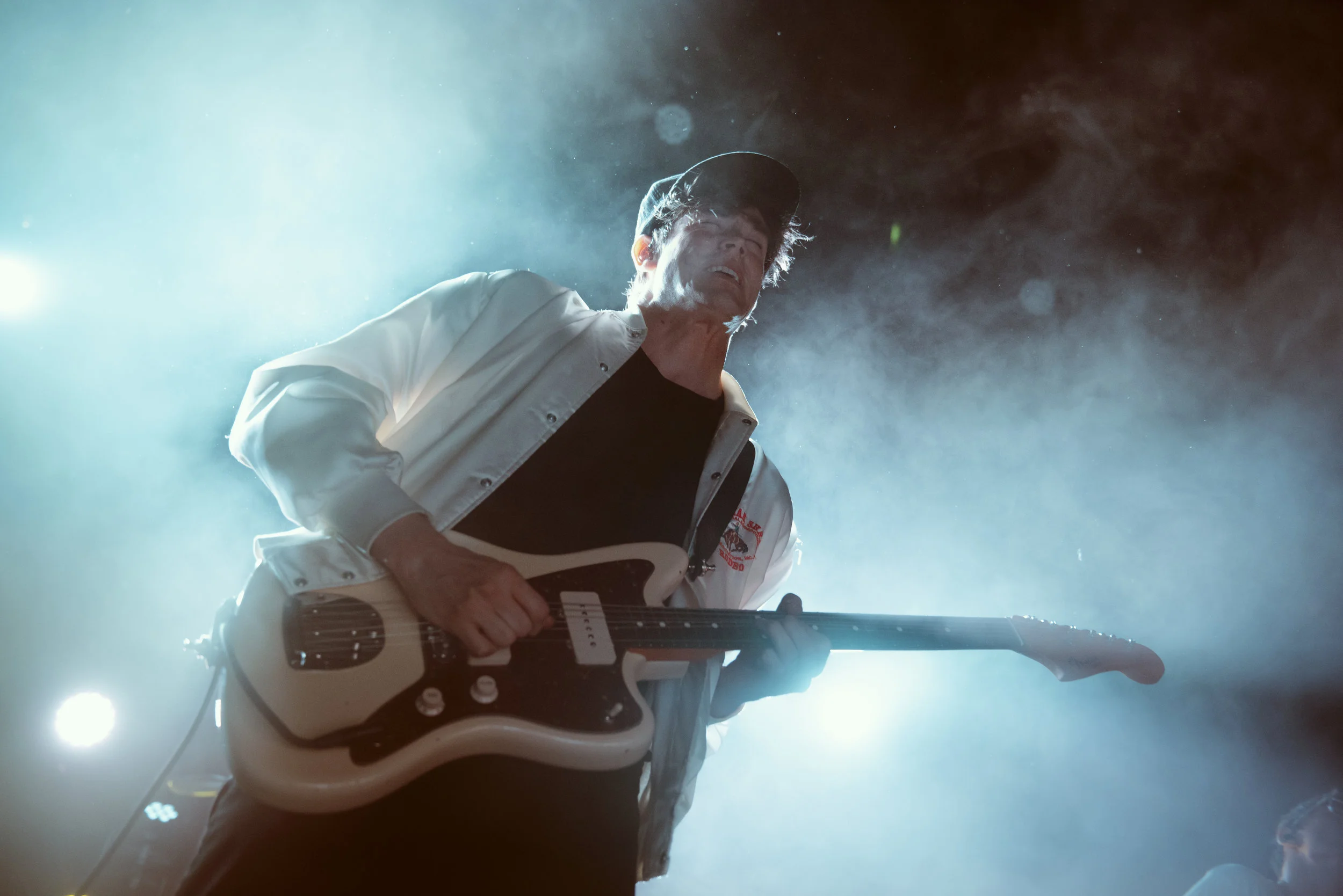
Creating New Colors for Hippo Campus
This show was a really fun one to shoot with lots of bright, vibrant lights, but when I left, I was feeling completely at a loss when it came to editing. A lot of the photos were super saturated, which is nice because it gave me a lot of color to work with, but most of the photos were also primarily backlit and I had no idea what I wanted the end product to look like.
Generally, I tend to lean more toward a pink/purple tint in a lot of my live photos, and that’s kind of what I ended up doing with this show as well, but for this shot in particular, the pinks and purples were really overwhelming and I completely lost the skin tone in the vocalist’s face, so I wanted to get that back.
(You can click to enlarge all of these images to see settings a little better)

Original image straight out of camera - 36mm, ISO 2500, f/2.8, 1/250
Auto/Custom White Balance
Most of the time, I shoot in auto white balance just because it makes life it bit easier with constantly changing stage lights, however for this show, the lights were almost consistently blue/purple, and I do have a custom white balance setting saved on my camera specifically for super saturated blue lights (because they’re so dang hard to edit). It really isn’t super necessary, but it definitely helps the editing process a little bit and it makes me want to tear my hair out less when I’m looking at the back of my camera between sets/shots. The top photo is with auto white balance, the bottom is straight out of camera with my custom white balance applied. It’s basically just a warmer tint to counteract the blues.
Temperature & Tint
The temperature and tint sliders are something I almost always play around with, even if just a little bit. This isn’t always the first step when I’m editing, but it’s usually one of the first because it’ll generally dictate how I edit the rest of the photo. For this shot in particular, I was just trying to get as far away from the super saturated magenta and purple as possible without having to desaturate the image at all, so I ended up getting a little drastic with things and pushing the sliders all the way to the end of the yellow and green. Usually this step is a bunch of toggling, but for this shot it was super straightforward.
Calibration
This is honestly one of the most important steps in my editing process. The calibration sliders have a TON of control over the tones of the image and have the ability to bring back even the most disgustingly saturated images. For this shot in particular, I wanted to get as much white out of the lights as possible, and wanted to start working getting a more natural looking skin tone out of the vocalist’s face. These sliders are something I come back to multiple times during any editing process - this is just how they looked at the end of editing this photo.
I HIGHLY recommend really playing with each of these sliders to see just how they affect your image. They make a world of difference.
Basic
Alright. Although these are some of the simplest sliders in Lightroom, they are some of the most important (to me at least) to get the look I’m going for. I remember back when I was taking a film class in high school (shoutout to Mrs. Suppes!) I was taught that most great images contain the blackest blacks, whitest whites and everything in between, and I really try to apply that to my live photos, especially when I’m trying to capture the glow and drama of the stage lights. I generally tend to really increase my highlights (unless the photo isn’t properly exposed) and bring up the contrast a bit to give the photo a more dramatic look. For this shot, upping the highlights also helped to get rid of a weird little halo around the light underneath the neck of the guitar, making the light look a lot smoother and more uniform. It also adds a bit of depth to the photo.
Curves
Curves are where a lot of my photos really start coming to life. Curves give you a lot of control over the colors and tones of the photo and can completely change the look of a photo with just a few quick clicks. For this photo, I really liked the subtle teal/blue colors I was starting to get in the highlights of the image, and decided that I wanted to try to bring them out a little bit more while keeping the shadows a warmer tone to contrast it. I also messed with the contrast a bit more. Like everything else, I tend to mess around with curves for a bit before I really find a look I’m going for. By this point in the editing process, I usually have a pretty good idea of what I’m going for though, so this just really helps it to come to life. Below, I’ll include what each specific curve looks like for this photo.


Split Toning
I looooove playing around with split toning. I almost ALWAYS do this immediately following curves and generally end up jumping between the two to even things out as I edit. A lot of the time, I’ll just drag the eyedropper tool around on high saturation until I find a look that I really like, and then adjust accordingly. For this photo, that meant continuing to bring out the teal highlights and red/orange shadows. This step and curves are generally when I finally start honing in on the tones that my final image will have. During this step, I almost always go back to the calibration sliders as well and tweak things that I feel are necessary until I get the colors that I’m looking for.
When using split toning, I really try to look for contrasting/complimentary colors that’ll make the image pleasing to look at. This is also a really good spot to try to get back some of the skin tones, which I did on this photo. The combination of greens and reds really helped out.
Final Touches
When I’m editing, I really like to focus on bringing out the glow and the ambience of the stage lights, so I usually tend to add some more color and bring out the highlights in the lights just a tad bit more using the Graduated Filter and Radial Filter tools. On this screenshot, the little gray dots signify all of the places I’ve added some filters to make the lights pop just a little bit more without applying these tweaks to the photo as a whole. I’ll also do this if I’m trying to dodge or burn the photo in specific places, or add a pop of color to a certain area.
Last but not least, I tend to add just a touch of de-noise to most of my images, just because after processing they can get a little noisy. Neither of these steps are necessary at all, these are just my own personal preferences.

Making Pinks Pop & Saving YUNGBLUD’s Skin Tone
Larimer Lounge is one of my favorite venues in Denver, but it is also one of the hardest venues to shoot. The room is really long and narrow, with a tiny stage allowing almost no room to work with or move, especially if a show is more than halfway sold. The house lights can be okay to work with and there are a few sweet spots on the stage that make shooting without a flash really easy, but for an artist like YUNGBLUD, who doesn’t stand still, this venue is definitely a challenge.
I actually shot half of this set with a flash for a shutter drag effect and half of it without one. The flash shots were obviously much easier to edit, but the ones without were a bit difficult, as the show was primarily lit by white front lights (god bless) and a bunch of blues (no thanks). For these photos, I really focused on not only getting back the skin tones that were lost in the mix of white and blue lights, but also making YUNGBLUD’s signature pink shirt & gear pop.
(You can click to enlarge all of these images to see settings a little better)

Original image straight out of camera - 24mm, ISO 4000, f/2.8, 1/200
Temperature & Tint
Unlike the Hippo Campus photo above, I knew exactly what I wanted out of this photo before I started editing, so my first step was trying to make him look less like a Smurf. I didn’t really focus on the tint slider this time around because I didn’t want to lose the pinks on his shirt and then gear in the background, but I immediately bumped the temperature slider all the way up. This helped to get rid of a lot of the blue.
Basic & Calibration
After bumping up the temperature, the photo became super washed out and over exposed, so my next step was bringing down the exposure a little bit to get some detail back into his face and drown out some of the unnecessary ambient light in the background. I was really focused on making this photo as crisp and clean as possible, so I brought the contrast up a bit as well.
I actually didn’t mess with calibration on this photo TOO much, since the temperature slider did a lot of the heavy lifting this time around.
Split Toning & Curves
The split toning is where the skin tones really started coming back to life in this photo. Although they weren’t bad once I tweaked with the temperature, I really wanted something a little warmer/yellow, and less pink. The yellows in the highlights and oranges in the shadows helped to get rid of the last of the blues in the house lights as well.
Normally, I really rely on curves when it comes to editing live shots, but I was already really happy with how this photo was looking and didn’t mess with curves too much this time around either, just a little bit of tweaking to even out the shadows and bump the highlights slightly.
Graduated Filters
Remember how I mentioned graduated filters before? Well I really relied on them for these shots, especially when it came to adding and removing colors and making an otherwise flat photo really glow. I used a couple of filters to darken the right side of the image and re-added some blue tones because I felt like it would help the pinks pop just a little bit more. Meanwhile, I brightened the left side of the photo and added some warm colors to compliment the string lights in the doorway. I also brightened the bottom part of the image a little bit because I felt like his leg was getting lost in the shadows and actually really liked the glow effect on the bottom of the photo. The last thing I did was darken the ceiling because at this point, I was getting really annoyed with that obnoxious vent above his head and wanted to get rid of it without spending forever editing the photo.
These are all things you could also do by dodging and burning the photo, I just prefer to use the graduated filters in my workflow. Again, there’s really no right or wrong way to do it, and this isn’t a necessary step at all when it comes to saving skin tones, it’s just something that I like to do with my photos.
Cleaning Up & Cropping
As I said above, I got really annoyed with the vent on the ceiling, so I ended up using a radial filter to remove it and the distracting exit sign at the back of the venue. These are definitely things you can also do using the clone stamp or spot healing tool in Photoshop, but again, it was just quick and easy for me to use these filters in Lightroom. I also just added one last adjustment to his face to make it just a tad bit warmer at the very end.
I also ended up cropping the photo in a little bit on the right hand side because I didn’t like that the subject was just slightly off center and there was a ton of unnecessary empty space on the right hand side. Like the step above, editing out the vent on the ceiling isn’t necessary at all, but it was a personal preference because I wanted this photo to be as clean as possible to focus strictly on the bright pink colors and the look on the subject’s face.


Making Pleasing Colors With Now, Now
This shot really isn’t anything too crazy, but I felt like it was a good example of how just a little bit of tweaking can really change the overall tone and vibe of a photo. I was honestly very happy with this photo of Now, Now straight out of camera, but as I began editing, I noticed that there were a few little distracting colors that I felt took away from the photo as a whole, and began working on making it warmer and more even/uniform. The skin tone was already there, which definitely made editing a lot easier this time around, but this photo wasn’t quite what I wanted until I played with the colors a bit more.

Original image straight out of camera - 24mm, ISO 1250, f/2.8, 1/125
Calibration
The first thing that I knew I wanted out of this photo was something that would mesh with the bright orange shirt she was wearing, so right away, I desaturated the blues quite a bit and messed with the green slider to create a warmer overall tone.
Basic & Curves
I actually didn’t mess with the basic sliders on this much other than to bring up the shadows slightly and up the contrast a little.
After that, I played with the curves to continue giving the photo a warmer tone. I really focused on bringing the reds into the shadows and yellows/cyan into the highlights. You can see all of my curves below.


Split Toning
Unlike the two photos above, I didn’t go too heavy on the split toning this time around. I just brought up the reds in the shadows and the yellow/green in the highlights some more.
HSL Sliders
This is where I realized what the photo was missing. I kept trying to push the warm tones, but felt that something was off, and it was only while I was working on split toning that I realized that all of the shadows were blue. It looked really off and unnatural, as I was attempting to make the shadows a more red/purple color, so I played around with the hue and saturation sliders to get rid of the blues and help create something a little more uniform looking. I ended up not touching the luminance slider, but I didn’t really feel it was necessary for this photo.
Final Touches & Filters
Last but not least, I played around with some graduated and radial filters to give the photo the last pop of color and little shine in the lights that it needed. I evened out the highlights and brightened the top right corner a little bit, darkened the edge of the stage so it was less distracting, and added more warmth to the bottom right corner to make the tones just a little more uniform. I also brightened her boots and added bit of warmth to her face using a radial filter to bring everything together. Not a huge change from the original photo, but warm enough now to give the photo a different mood and make it feel a bit more even.


Obviously, all of the examples above are all my own personal preferences and are not the be-all-end-all when it comes to editing, but I’ve had a few people ask about my editing process and how I chose the tones that I use in my photos, so hopefully this give a bit more insight. I’m definitely still learning when it comes to editing and retouching and feel like I’m growing with every show I shoot, but I figured I’d share my current process.
I may end up posting more tutorials in the future, so let me know if there’s anything that you’d like to see!